So with the whole world in financial breakdown what better time for studios to try and get its audience to double dip and reinvest by re-buying classics they already own on Dvd in a new "Hi-def" "Ultra" "Blu-Ray" format. Having said that Blu Ray is proving to not be quite as expensive as one would think with titles being maybe $5-10 more than the standard dvd version, fair enough it comes with clearer picture and better sound, why not? It's just going to be my dvd version upgraded with the same special features or new ones right? not always. Ok well seeing as its a hi def ultimate edition its at least gonna look good right, I mean its gonna come in a good presentation case and look well "ultimate and special" you know a collectors edition? not always.
I have browsed through pages of Amazon's Blu-Ray section to find some of the most appalling covers imaginable, they look like someone got a bunch of cocaine and churned out each one in five minutes using Photo-shop or it's mentally challenged cousin CorelPhoto.
Following are some of the biggest monstrosities that I could find, click on the pictures to enlarge the image and see the madness for yourself, not all of these films are good, some aren't even watchable (Vantage Point) but i would think that the studios would actually want people to buy them. First off is Kubrick's classic epic war film, the original cover was symbolic it's an iconic poster that doesn't require any text to know which film is on display, this Blu-Ray cover looks like it's been designed for a rushed video game based on the movie, an absolute atrocity the kind of cover that could "suck a golf ball through a hosepipe."
 Next Coming to America this was during Murphys' 80's phase where he had just done the second Beverley Hills Cop and had survived The Golden Child incident. The film itself is funny it's Murphy and Landis reuniting for the first time since Trading Places this monstrosity of a cover is draped in a cheetah skin border with horrible typography, that just doesn't fit, the whole composition is off. I'll take the original cover any day this looks more like the Norbit phase of his career than the 48 Hours period. A very s*itty cover.
 To put this cover for Rocky simply, it's lazy there's nothing here whole idea of the cover is wrong it doesn't connote the miraculous underdog story the film contains. It's wimpy. Rocky doesn't look like a winner, he looks like he's had the crap beat out of him and lost. A definite sh*tty cover done in about five minutes, are they really expecting this crap to catch peoples eyes, you can't even see his boxing gloves.
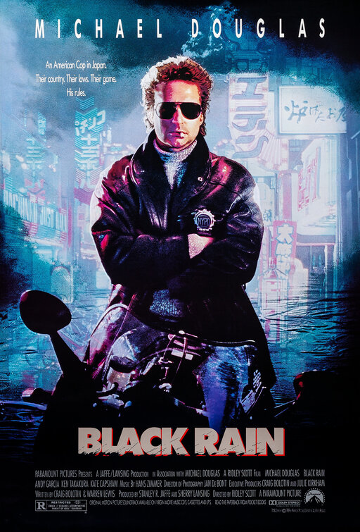
 This cover for one of the most underrated Ridley Scott films does it absolutely no justice, it looks like a run of the mill lame action cop drama. The cheesy fonts slanted for some reason makes it look like a buddy cop comedy, instead of the gritty, atmospheric, dark action film it really is. Take a look here at the original poster, I don't know who in their right mind would think that this cover is in anyway better than that. Whats "special" about that cover other then it's designer.
 So after Tomb Of The Dragon Emperor why any one would want to own the third film I can't understand and this cover would actually be acceptable, even kind of cool i mean it shows all the covers of the three films but then someone got carried away and added a giant 'M' to separate the images, why? What significance does this 'M' possibly have? Surely the glowing 'M' was enough.
 The cover for Oliver Stone's Nixon biopic does not depict the dodgy ex president at all it image looks as if Nixon has just one a marathon, come to think of it it looks a bit like the long lost Blu-Ray cover for Rocky. Horrible font and the worst reason to have a special edition i can think of. I mean why bring out a "special election year edition" to commemorate a new president by trying to honor a film about one of the worst. Maybe in eight years when another new president is chosen they'll do a worldwide thing and the Kim Jong Ill film that with inevitably be made will get the special Dictatorship edition.
No Donnie Brasco isn't a great true story of Mafia crime done well, this is a film about two people walking, the slanted titles seem like this is a nice buddy comedy about two guys in craazzzy situations and the extended cut means that they can now walk for even longer, the cover shows nothing about the film, a definite "fugazi" The cover for in my opinion Will Ferrell's best film makes it look like a generic crappy romantic comedy instead of the brilliantly original comedy it is. the main characters are all copy and pasted and I can't really remember grass having such prominence in the film at all, this is about as eye catching as freshly mowed lawn, yet again a definite Shi^ty cover.
 I'am just surprised not to see Steven Segal in this one looks like a cheesy crappy action film, instead of the entertaining cheesy action film that it is, some copy and pasting shows the two main characters along with lots of fire, how interesting. what an amateur shi*tty cover, just use the original if no one bought that version they're defiantly not going to buy this one.
 Wow I have already burnt this film so much but it deserves so much more, anyone who went to see it originally in the cinemas because the poster looked kind of interesting runs no risk of being conned here, this is probably the most appropriate cover for a movie ever. Are they actually trying to sell this film or did they finally realize it's terrible.
so the message we've learn't here is if your going to release a blu ray edition just use the same classic poster that everyone recognizes and adores instead of insulting the customer and the film itself.
What do you think, did we miss any out?
![]()
![]()
Subscribe to:
Post Comments (Atom)
0 comments:
Post a Comment